Government
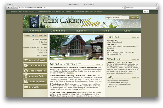
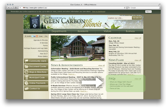
We will take a few minutes now to look at some actual websites that include examples of what is possible on a government site. First, we are visiting the site of Glen Carbon, Illinois (http://www.glen-carbon.il.us).
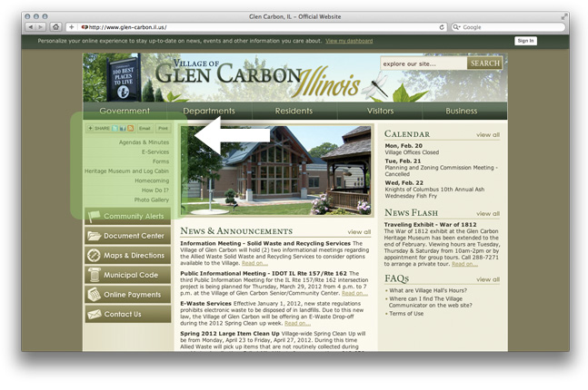
What are your first impressions of this site? How do the colors strike you? The layout? Note that each of the headings across the top is a drop down menu to help get the users to the information they are seeking.
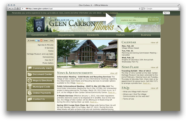
No matter how carefully you plan your site, a search box is useful for those users who want to find what they are looking for quickly.
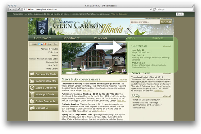
A calendar is a nice feature on a public site, such as this one where there are many meetings and events.
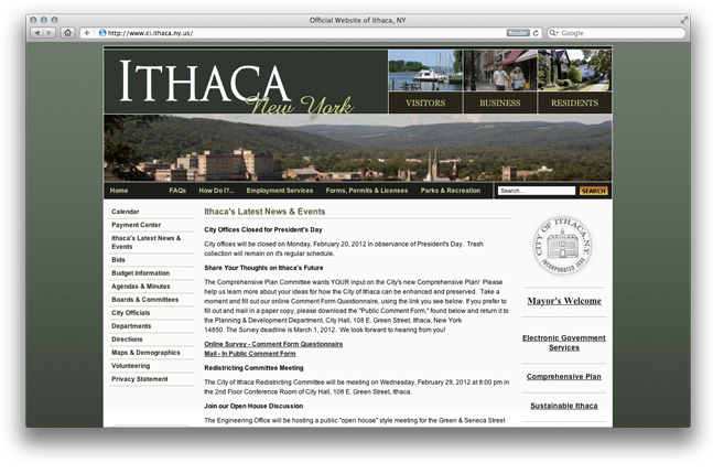
Here is another example. If you look at top right-hand corner, you see that they have clearly identified their target audiences in addition to providing access to pages such as the FAQs, Forms, Permits & Licenses, and Parks & Recreation in the navigation bar across the top, and the same information is organized yet a third way in the left column.
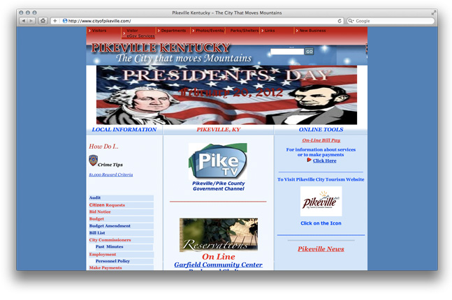
Next, we will visit the website for Pikeville, Kentucky (http://www.cityofpikeville.com/). Pikeville, KY has developed a website that provides its constituents with numerous services – from paying utility fees and fines to reporting street repairs, searching local government documents, and reserving shelters at the park. Let’s explore a couple pages…
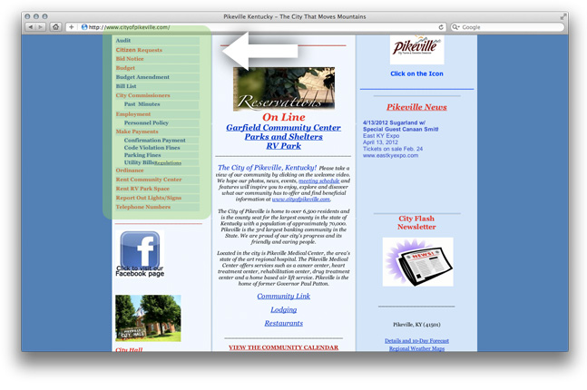
By scrolling down the left column, we can see the many different types of information provided. By clicking on the Parking Fines link we go to another page.
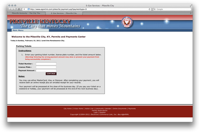
This takes us to a new page where a form allows us to provide the information necessary to pay the fine. Hitting the Continue button would then take you to a secure payment screen where you could enter credit card information.
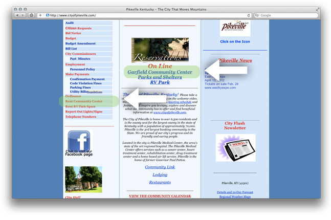
Let’s see how we might reserve the community center for an event. Notice there are two links from the home page that will take you to the same place. If you recall that different groups of users respond to different types of prompts, this duplication makes sense in many instances.
Clicking on either of these links takes you to more information.
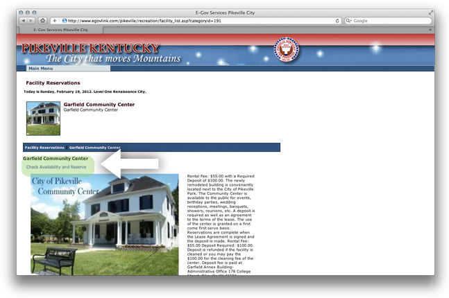
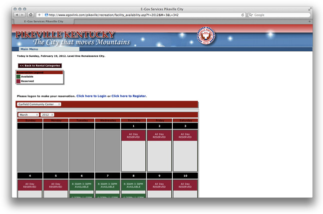
Click once again on the link Check Availability, and you go to a calendar where you can see what dates and times are available. Clicking on the time you are interested in takes you to a form to reserve the space.
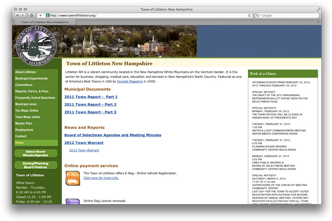
Littleton, New Hampshire’s website (http://www.townoflittleton.org/) shows some examples of using maps on the website.
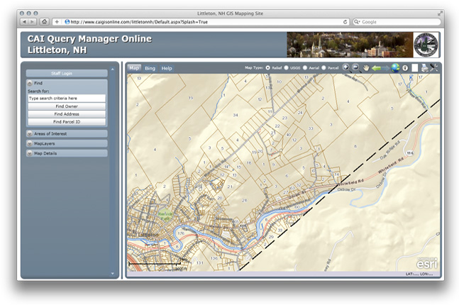
By clicking on the Town Maps link, users are taken to an interactive map where they can research many aspects of the community, from tax parcels to areas of interest to wetland locations.
Now that you have reviewed a few examples of what is possible, let's move to the reflection page so you can put down some ideas for your site.